Table of Contents
VADY GenAI Dashboards: Simplifying Data, Amplifying Decisions
Introduction: From Delay to Instant Dashboards
Picture this: It’s Monday morning, and a sales manager urgently needs a revenue breakdown by product line to prepare for a critical board meeting on Wednesday. She submits her request to the analytics team, knowing it will take a few days. This scenario plays out every week in organizations around the world. Business leaders want answers quickly, but traditional BI tools are slow, complex, and resource-intensive. Enter VADY GenAI Dashboards, a revolutionary way to turn questions into live dashboards in minutes. Instead of waiting days or weeks, anyone from a frontline manager to a senior executive can type a plain-English request into a simple form and get a fully interactive, AI-powered dashboard almost instantly.
This isn’t just about speed, it’s about empowering every employee to become data-driven. By saving hours each week, freeing analysts from repetitive requests, and making insights instantly available, VADY GenAI Dashboards rewrite the rules of decision-making. The result? Smarter, faster, and more confident business choices across every level of the organization.
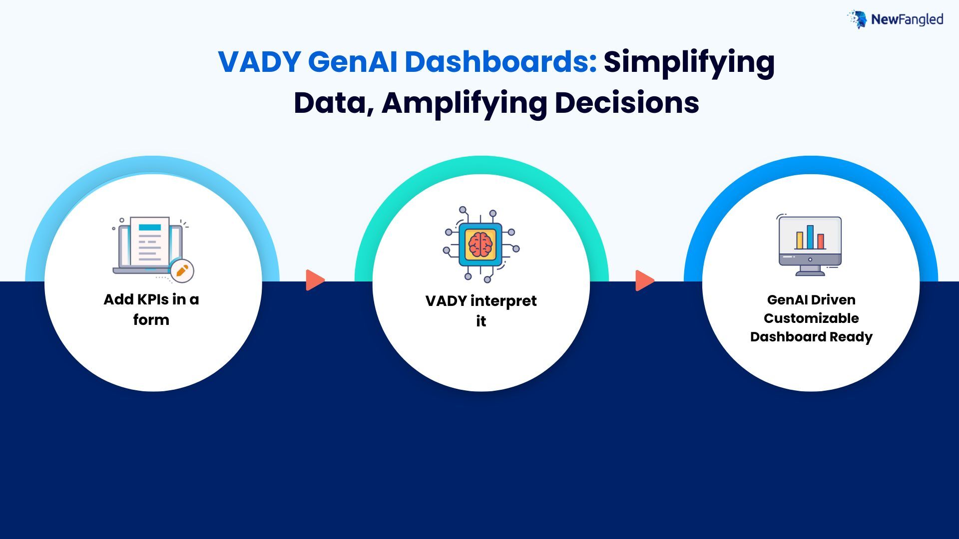
How Do VADY GenAI Dashboards Work?
Step 1: A Simple Form Anyone Can Use
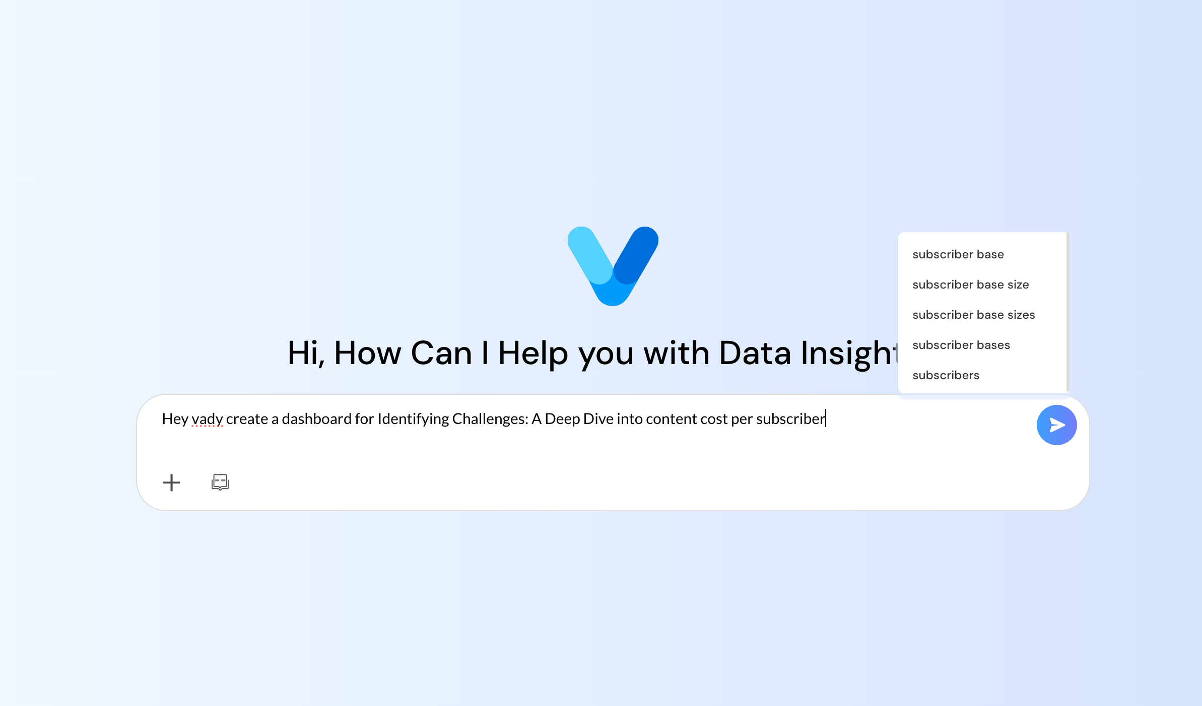
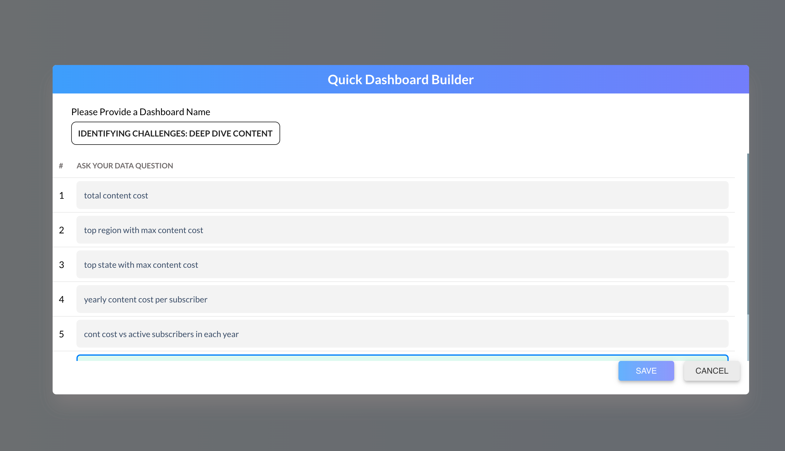
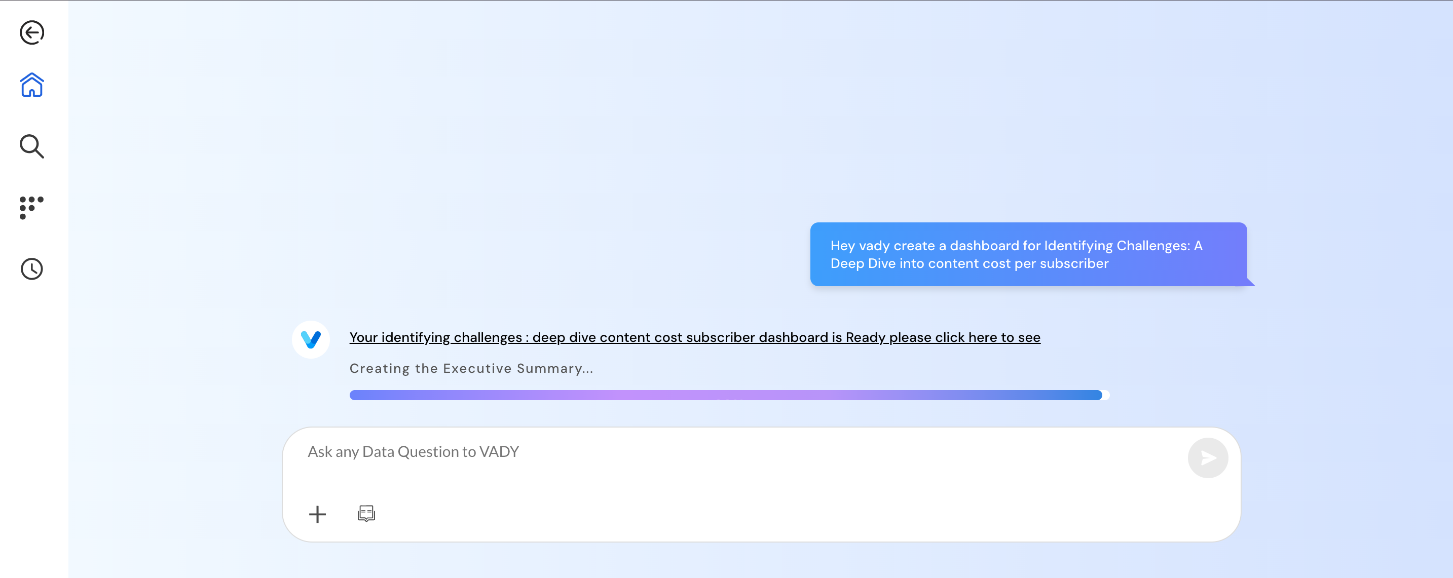
Click Create Dashboard or ask VADY. Enter a title. Ask your question. That’s it. No SQL, no modeling steps, no wrestling with chart libraries. Your everyday language is enough to get started.
Step 2: Interpreting Intent with NLP & a Semantic Layer
VADY uses NLP to parse your question understanding entities like time ranges, regions, product lines, and measures such as revenue, cost, or headcount. Behind the scenes, a governed semantic layer maps these terms to your organization’s trusted definitions. “Revenue” means the same thing for Sales and Finance. “Churn” isn’t ambiguous. This is how VADY GenAI Dashboards stay both simple and correct.
Step 3: Auto-Building a Live, Shareable Dashboard
Within minutes, VADY assembles a well-structured dashboard:
- Relevant charts (e.g., trend lines, bar comparisons, cohort analysis)
- Smart filters (date ranges, regions, products)
- Clear layout (above-the-fold KPIs, supporting visuals below)
You’ll get a unique link to share with teammates, who can explore without breaking the view.
Step 4: Exploration: Filters, Drill-Downs, and “Aha!” Moments
Dashboards aren’t static PDFs. You can:
- Filter by region, segment, product, or time.
- Drill from a total to the drivers (e.g., category → SKU → account).
- Edit on the fly add/remove KPIs, swap chart types, or change groupings.
That fluid exploration is where understanding happens fast.
Why VADY GenAI Dashboards Save Time
No More Analyst Bottlenecks
Traditional BI platforms often require specialist knowledge. Analysts must model the data, prepare queries, and design visuals. Even a simple KPI request can take hours. Multiply that by dozens of requests per week, and the backlog grows.
With VADY GenAI dashboards, frontline managers no longer wait in line. Anyone can create their own dashboard in minutes freeing analysts to focus on advanced modeling and predictive analytics.
Real-World Examples of Time Saved
- Sales Manager: Created a quarterly revenue dashboard in under 5 minutes, instead of waiting 3 days.
- Finance Lead: Discovered a logistics cost spike instantly, saving a week of reporting.
- HR Leader: Analyzed attrition patterns across 4 departments during a single meeting, rather than waiting for month-end reports.
Each example shows the same theme: VADY reduces dashboard creation from days to minutes.
The Hidden Edge: GenAI Insights
Beyond Visualization
Most dashboards only show what happened. But leaders also need to know why it happened. The VADY GenAI dashboards solve this with built-in narrative insights.
Examples include:
- “Sales dropped 12% in Q2 due to a 15% decline in the West region.”
- “Attrition increased in Department A, primarily among employees with less than two years of tenure.”
And when deeper answers are needed, every chart is interactive. Click on a data point to drill down into its root cause.
By turning raw numbers into plain-language explanations, VADY reduces cognitive load and speeds up decision-making.
Root Cause Analysis with a Click
Every chart is interactive. Users can click on a data point, a revenue bar, an attrition line, or an expense bubble, to drill into the underlying drivers.
Example: A finance leader notices rising expenses in Q2. With one click, she drills into categories and discovers logistics costs surged 25% due to shipping delays. Within minutes, she has an explanation and a plan to act.
This root cause clarity makes VADY dashboards not just reporting tools, but engines for problem-solving.
Use Cases Across Teams
Sales: Territory, Product, and Pipeline Intelligence
- Territory performance: Compare regions and reps in seconds, spot gaps, and reallocate focus.
- Product mix: Understand which lines carry the quarter and which need attention.
- Funnel health: View conversion by stage, cycle length, and win rate—right when forecasts shift.
Micro-move: A sales director filters West → Enterprise and sees Product B lagging. Two targeted enablement sessions later, the region’s win rate lifts by 6%.
Finance: Variance, Spend, and Profitability Control
- Budget vs. actuals: Track variance daily, not monthly.
- Expense forensics: Drill to vendors, categories, and projects to catch surprises.
- Profitability: Analyze contribution margins by product, channel, or customer segment.
Micro-move: A controller sees Q2 logistics up 25%. With two clicks, it’s traced to rush shipments after a supplier delay. Decision: negotiate expedited terms; result: cost pressure eases next quarter.
HR: Attrition, Engagement, and Headcount Health
- Attrition patterns: Slice by tenure, department, role, location.
- Engagement signals: Overlay survey data with attrition to identify hotspots.
- Hiring velocity: Track time-to-fill vs. ramp outcomes.
Micro-move: HR notices exits cluster at the 12–18 month mark in Support. A revamped mentorship program reduces early exits over the next two quarters.
Operations: Bottlenecks, SLAs, and Supply Chain Resilience
- Throughput: See cycle times by step; fix the slowest link first.
- SLA compliance: Monitor breaches by site, shift, or carrier.
- Supply chain: Track fill rates, backorders, and on-time-in-full in near real time.
Micro-move: Ops identifies one picking lane causing 30% of late orders. After rebalancing staff and updating the pathing, on-time shipments jump within a week.
The VADY GenAI dashboards empower every function — from frontline staff to executives — to answer their own questions without waiting for specialists.
Legacy BI vs. VADY GenAI Dashboards
Here’s how VADY compares to traditional BI tools:
| Feature | Legacy BI | VADY GenAI Dashboards |
| Setup Time | Days | Minutes |
| Skills Required | SQL, analysts | Plain English |
| Cost | High analyst dependency | Lower, self-service |
| Flexibility | Static reports | Interactive, AI-powered |
| Insights | Descriptive only | Explanatory + root cause |
| ETL/Cleaning data | Manually | Automated scripts |
Bigger Picture: Democratizing Data
When dashboards are easy, analytics stops being exclusive. Instead of depending on IT or analysts, every employee becomes empowered to explore data.
- Frontline staff can answer immediate operational questions.
- Managers get fast clarity for team performance.
- Executives make quicker strategic choices.
This democratization drives a cultural shift. The VADY GenAI dashboards don’t just save time; they transform organizations into data-driven decision-makers.
Conclusion: From Form to Full Dashboard in Minutes
For too long, businesses have accepted that data-driven insights require delays, complexity, and specialist intervention. But in today’s world, where decisions need to be made in real time, waiting days for a dashboard isn’t just frustrating, it’s a competitive disadvantage.
VADY GenAI Dashboards flip that equation on its head. With nothing more than a short form and a plain-English question, any employee can generate a dynamic, interactive dashboard in minutes. Teams save countless hours every week, analysts are liberated to focus on advanced strategy, and leaders gain the confidence to act quickly with the most up-to-date information.
But the real value goes beyond time savings. VADY is about democratizing data breaking down the barriers that make analytics the domain of a few specialists and putting powerful insights into the hands of everyone. From sales and finance to HR and operations, every department gains the ability to not just understand what is happening, but also why.
What once took days now takes minutes and that time saved is what powers smarter, faster, and more inclusive decision-making.
![]()
I work at NewFangled Vision, a 6-year-old private GenAI startup from India. We build enterprise-grade AI systems without large LLMs or heavy GPU dependence, with a mission to make AI a seamless, must-have capability for every organization—without complexity or hassle.