Table of Contents
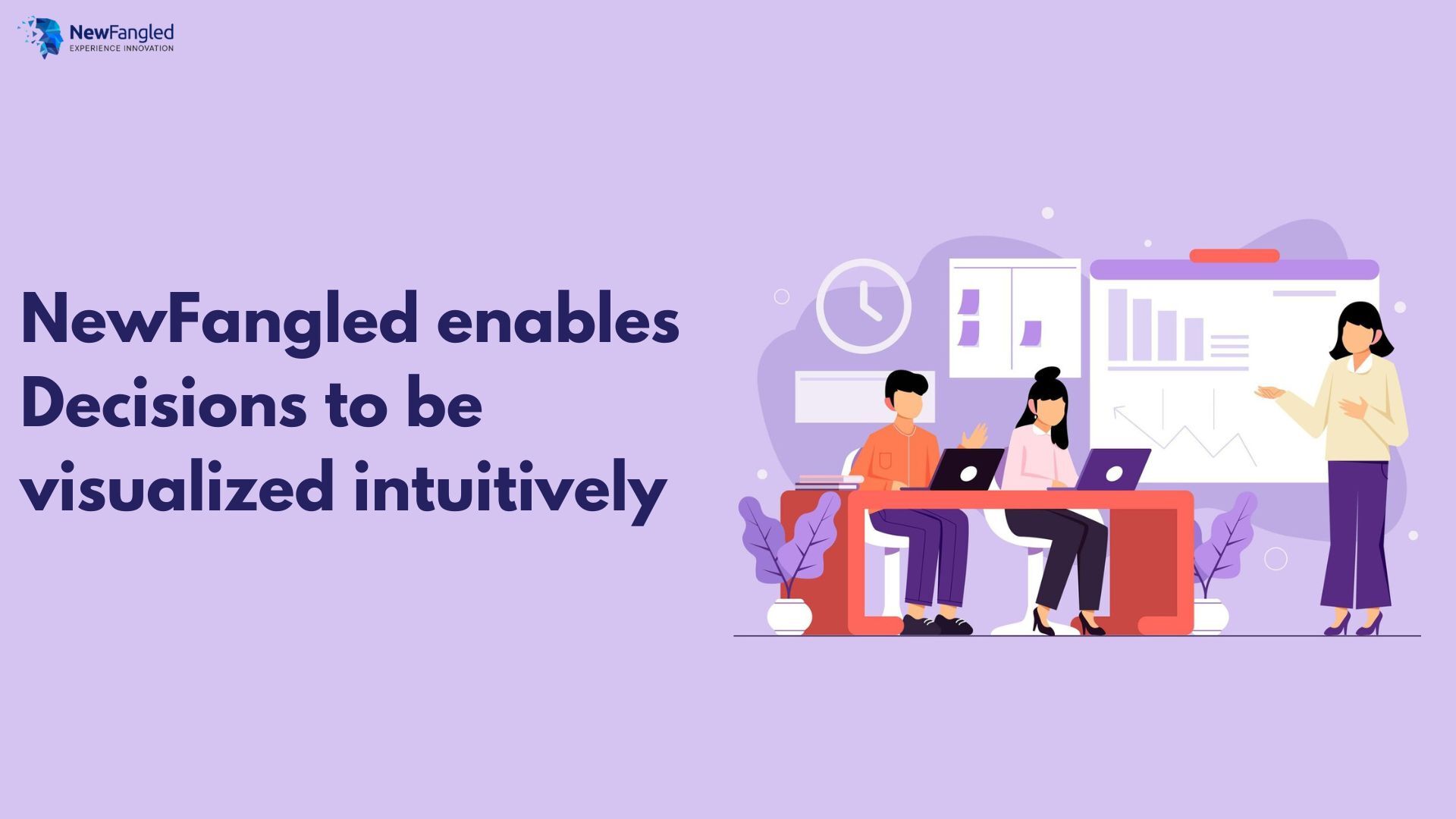
Data Visualization Has Metamorphosed Decision Making for Gen Next
We all use Data for various purposes given the need it creates when it is generated in one form or the other, especially for academics and businesses. In its raw form, it is as good as nonexistent, however, when it is tweaked, transformed, and put to readable use by either humans or machines that is when it attains some meaning and importance.
When we actually see Data visualization from its humble beginnings in maps to more sophisticated techniques we realize the true use of a representative power. So as they say a picture is worth 1000 words, which makes so much sense today when time has become the most expensive of the commodities.
Why Data Visualization
In terms of technology, the main goal of Data visualization is to make it easier to identify patterns, trends, and outliers in large data sets so credit must go to the fact that spreadsheets changed the information visualization format entirely.
Data visualization means drawing graphic displays to show data that might otherwise be challenging to understand. Sometimes every data point is drawn, as in a scatterplot, and sometimes statistical summaries may be shown, as in a histogram.
The displays are mainly descriptive, concentrating on ‘raw’ data and simple summaries. They can include displays of transformed data, sometimes based on complicated transformations but in the end help to decipher the hidden message inside those numbers or textual arrangements.
Advantages of Data Visualization
At NewFangled we have always believed that it is all about the ways a human mind is trained or built to understand things, to comprehend and act upon the information that is processed which gives in to the fact that a human brain processes images much better than textual inputs.
Data visualization therefore provides a quick and effective way to form patterns that communicate information in a universally acceptable manner using visual information. The biggest advantage of Data visualization is the power to make things simple so that a Decision can be made because it is considered as a visible proof that can be established as an argument itself.
PolusAI from NewFangled
PolusAI is a powerful GenAl-Driven NLP-based platform that empowers users with conversational capabilities and interrogates Enterprise Databases like RDBMS NoSQL Druid.
Kafka, etc in Plain English. The output is realized by NewFangled PolusAI is in the form of tabular format and graphical layouts.
Different chart types such as Bar chart, Stack chart, Pie chart, Ogive chart, Area chart, and many others allow the Data to be plotted extremely fast and with the capability to have a drill down and slice & dice as well to cover all facts and dimensions that map Data thereby making NewFangled PolusAI the ideal choice for Decision-makers.
The AI-Driven Dashboards and Reports Discovery by Machine Learning Connecting Insights to Action come alive instantly in a very crisp and clean manner too.NewFangled achieves this visualization ask covering major goals such as
- The richness of the capabilities— the depth of insights that can be derived through the NewFangled tool.
- Explanation of the information to the users – with mouse hover showing info snippets instantly.
Just like other tools, with NewFangled, Data is visualized in the form of KPI widgets and Dashboards. Widgets are very useful to put emphasis on the key metrics in the dashboards so that data can be compared easily.
The metrics come with comparison indicators for focusing on the trends. The dashboards are useful for combining many KPI widgets and multiple reports on a single page. Two advantages are availed this way. You can refer to a single page for a quick overview.
Also, the dynamic filtering feature helps in viewing any specific information. NewFangled has ensured easyness of access with an added functionality of voice-enabled commands to create visually appealing and feature-rich dashboards and reports.
Conclusion
NewFangled has stepped up on the advancements that the world demands today from high tech and incorporated Generative AI technology to leverage visualization capabilities inside its powerful PolusAI platform. Today, businesses can easily plan to stay ahead when it comes to Data management and Business intelligence capabilities with in depth analytics.
![]()

With over 25 years of rocking it in Sales and Marketing, Amit is the industry guru! He’s all about tackling problems that help businesses level up. He’s totally into tech that’s user-friendly and super easy to get the hang of. That’s why he’s head over heels for NewFangled’s Generative AI Platform—it’s a game-changer! Amit’s so passionate about it that he spends loads of time diving deep into its possibilities.